What is the ecommerce customer experience?
It’s CX within an online shopping context. CX (Customer experience) is the experience a customer has of your business as a whole, including every point of contact and every interaction, good or bad.
An important aspect of CX is that it’s holistic – it comes out of a sum total of experiences, rather than one single event. Although every interaction making up CX is important, it’s the overall impression that really makes the difference to a customer, and in turn, to the fortunes of your business.
Good CX creates a cascade of positive outcomes. Happy, trusting customers are more likely to make repeat purchases. They’re more likely to leave good reviews, recommend you to friends and colleagues, and to develop lasting positive beliefs about you as a business.
In ecommerce, customer experience has the potential to mark you out among your competitors as a preferred place to shop. It can help break down some of the barriers inherent in ecommerce, such as reluctance to pay shipping, fears and doubts about processing credit card details or financial information, and hesitance to buy in case the return process is difficult or impossible.
Ecommerce customer journey stages
The ecommerce customer journey follows a typical customer through their relationship with your business, starting from the moment they become conscious of what you offer, and moving through consideration and purchase to ownership and post-sales. Here’s an overview.
1. Awareness
A customer finds out who you are and what you have to offer, and gets a first impression of your reputation and brand values through channels like advertising, word of mouth, social reviews and recommendations and what they see on a search engine results page.
2. Consideration
At this point, the customer begins to match up your offering with their own needs. You have something that could help them, but are you the right choice, or is one of your competitors?
The customer tries to answer this question using information like review sites, the content on your own website and that of your competitors, any promotional emails you’ve sent them, and information about the customer experience from sources like delivery, guarantee and returns content on your website. They might also be swayed by retargeting ads that remind them of items they’ve viewed.
3. Decision
Having made the decision to buy from you, the customer makes their purchase. They’ll use your ecommerce site or app to add items to their basket, find and use a discount code or voucher if they have one, add their payment details and make the payment, and if they’re buying on finance, set up their finance or buy-now-pay-later details. Finally, they’ll look in their inbox for a confirmation receipt and shipping details.
4. Service / ownership
At this stage, the product is delivered and the customer takes ownership of it. As well as interacting with the product itself, they may be in touch with you for customer service and support questions about how to use it. They may want to give feedback or leave a review on your website or elsewhere.
And if the product hasn’t met their expectations, they will take advantage of any returns and refunds process you have – this will include things like getting and printing out a shipping label, finding a drop-off location or booking a courier, and receiving the money back into their account.
As you can see, there are a huge number of possible touchpoints in even a straightforward ecommerce transaction. Your task is not only to improve each of these touchpoints, but to make sure the journey across them is as seamless as possible, and that all the aspects link together smoothly and coherently. The customer should never lose the sense that they are dealing with a single entity and that everything on your end is joined up and interconnected.
eBook: The digital experience playbook
Free downloadHow to improve the experience
Here’s a step-by-step look at how you can improve the ecommerce experience across the entire customer journey, from awareness to ownership.
Advertising
Whether you choose social media advertising, web advertising networks, offline options like print ads and above-the-line media, or a combination of several methods, it’s essential to make sure your ecommerce advertising is targeted to your audience. Ideally, you will have user personas already set up to base your advertising strategy around.
Make sure your adverts are targeted to appeal to what your audience most cares about. This might be your low prices, the range of products and brands you stock, any exclusives or special deals you are offering, or your generous return policy, finance options or shipping.
Make sure the branding and visual identity of your ads is closely aligned to your shop to help build familiarity and confidence when the customer arrives on site.
Social media
Your presence on social media should follow omnichannel best practice and act as a natural extension of your wider presence. Customers should be able to get the same level of service and responsiveness from your social media channels as they do from your online customer service or in-store employees. They should also see the same branding and up-to-date communications about your latest campaigns and offers.
Ideally, you will have your social accounts connected to the same centralised back-end system as the rest of your customer service operation, so that customer relationship information is used by all teams and the customer gets a seamless experience.
Make use of all social media tools available, including chat and direct messaging, to connect to your customers, bearing in mind that their expectations will have been set by competing businesses and other ecommerce brands.
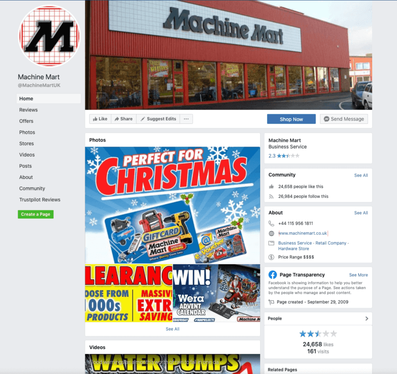
For example, Machine Mart has set up its Facebook page to prompt users to contact them via Messenger, automatically opening the chat window which is populated with suggested questions.

Website experience and UX
Website UX plays a huge role in positive ecommerce experiences and is an area that deserves significant investment if you want to create a competitive level of customer experience. You will need to make sure that website navigation, information hierarchy (which will show up for the customer in product page breadcrumbs), technical functioning and journey flow are all tested and optimised around the needs of your users.
At the same time, look to your visual design and images, UX copy and messaging to make sure they are supporting users in making a purchase. Images especially can have a huge impact on the decision-making stage of the customer journey, so make sure you have multiple images of the products in high resolution, and if possible provide video too.
It should go without saying that your website should be fully optimised for mobile users.
Customer support/chat
Chat services should ideally mirror the level of service customers receive in person at a physical location. To make that happen, there are two essential ingredients – the technical infrastructure supporting your chat function, and the people who answer and resolve customer queries.
Make sure that your chat software is well integrated with both your website or app and your customer service team’s software. Identify and minimise any lag caused by technical errors. On the human side, make sure your agents have the information and decision-making power they need to satisfy customers, and avoid overloading them with cases as this can create delays.
For many businesses, there’s also a lot of value in using chatbots to solve straightforward customer issues, as this provides an immediate response and can take the pressure off human agents.
Website feedback
Your ability to collect and act on customer feedback might be one of the most important ingredients for good ecommerce experiences. Customers shouldn’t have to look for where to feed back if a product page is lacking information, the website is slow or glitchy, or if a technical error has prevented them from making a purchase.
You can use contextual and persistent feedback modules on your product pages to make sure customers always have the opportunity to let you know if something’s not working for them. You can also add website feedback prompts to other scenarios where customers might offer feedback, such as when they’re in touch with your support team or filling in a customer experience survey.
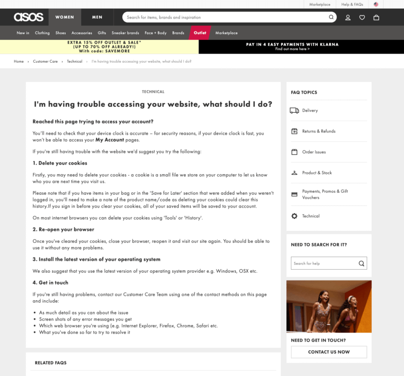
ASOS provides a self-service support page to help customers solve their own technical issues, with an option to get in touch if the suggestions don’t help.

Site speed
Speed and responsiveness is crucial for ecommerce transactions, and customers can and will click away if your site doesn’t load fast enough. Keep a close eye on your website speed and performance across all major browsers and operating systems.
Personalisation
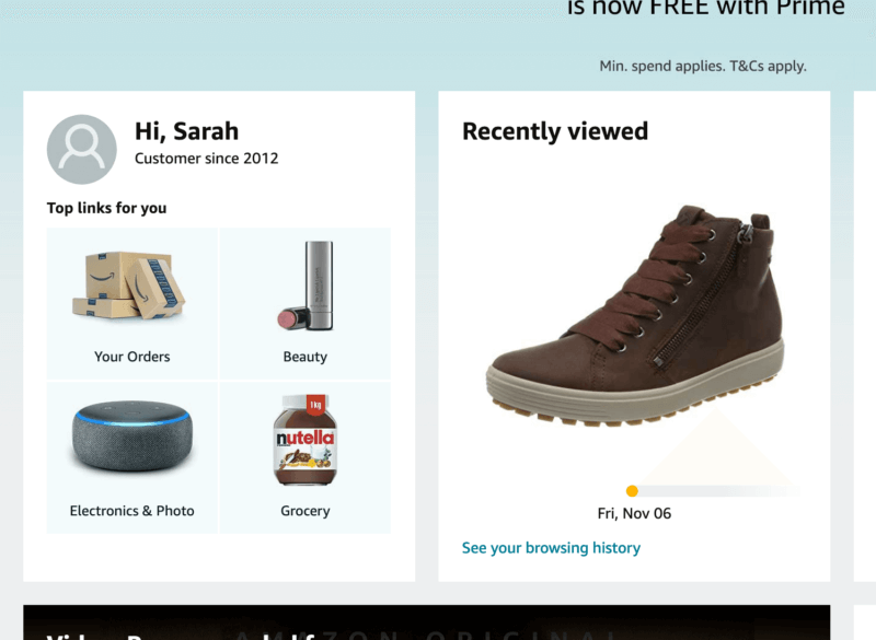
You’ve taken the time to get to know your customer – so show them the benefit by providing personal experiences on your ecommerce site. This might take the form of personalised recommendations based on their past purchases or browsing history, or you might display a personalised greeting when a user is logged into their account, as Amazon does.

Cart and checkout process
The shopping cart and checkout environment is a make-or-break feature for ecommerce sites, as it’s where customers are most at risk of dropping out if something puts them off completing their purchase.
Test, test and re-test your checkout process with users to make sure everything makes sense and there are no errors or confusing experiences. If everything is working well, it’s still a good idea to add copy and messaging to reassure them about any concerns they may have around things like the security of their personal details or credit card information.
Abandonment surveys
Cart abandonment is a fact of life in ecommerce. But while some level of abandonment is unavoidable, there are steps you can take to understand why it happens and help reduce your abandonment rate in the future.
One way to do this is with abandonment surveys. These are served to customers when they abandon a basket or bail out during the checkout process, requesting feedback on what has gone wrong. They can – and should – be short and to the point, minimising customer effort as much as possible using question types like multiple choice or sliders.
Abandonment surveys can appear on screen when a user leaves the site, or they can be presented as part of a wider series of cart abandonment emails.
Delivery
Having a broad range of shipping and delivery options means you’re more likely to provide the solution your customer wants. As well as free basic shipping, if you’re able to offer that, make sure you also offer a premium expedited service for customers who need their items urgently.
Click and collect is ideal if you have a bricks and mortar store, but if not, you can still offer the service by partnering with a network that makes pickup available from shops local to the customer.
Returns
All UK online retailers must offer at least a 14 day cancellation period for items over a certain value. But on top of that statutory requirement, most online retailers offer a return policy of their own.
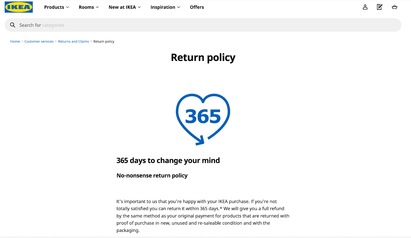
How generous you can be with returns depends on your business, but from a customer’s perspective, a longer returns period – like IKEA’s 365 day returns window – is likely to be more attractive and encourage them to buy with confidence. Interestingly, longer returns periods are actually linked with fewer returns, according to a 2016 study by the University of Texas.

Bringing it all together
Optimising your ecommerce experience is a complex process, and one you’re unlikely to complete in a day or two. It may involve a lot of different people from different parts of your business.
The most crucial element to success is staying focused on your goal of omnichannel improvements. Make sure everyone involved is briefed on the overall objectives of the project and the idea of creating an omnichannel experience.
After all, from the customer’s perspective you are a single identity. And from any point of view, the whole of your business working together is greater than the sum of its parts.
eBook: The digital experience playbook