Number Chart Widget
About Number Chart Widgets
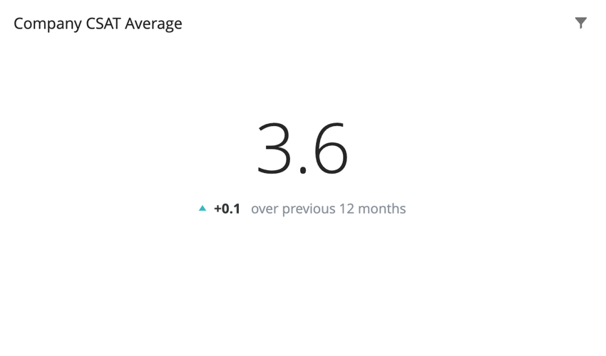
The number chart widget displays a single numerical value. This value is based on a single metric. Depending on the metric chosen, the numerical value displayed can be based on a field from your dataset.
Types of Dashboards
This widget can be used in a few different types of dashboard. This includes:
Field Type Compatibility
The number chart is based primarily on a metric. Certain metrics, such as average, require a field from the dataset. Only fields with the following field types will be available when selecting a field for these metrics:
- Numeric Value
- Number Set
- Measure Group (CX)
In EX dashboards, you can also select categories, so long as they are a numeric value or number set field type.
Widget Customization
Basic Setup
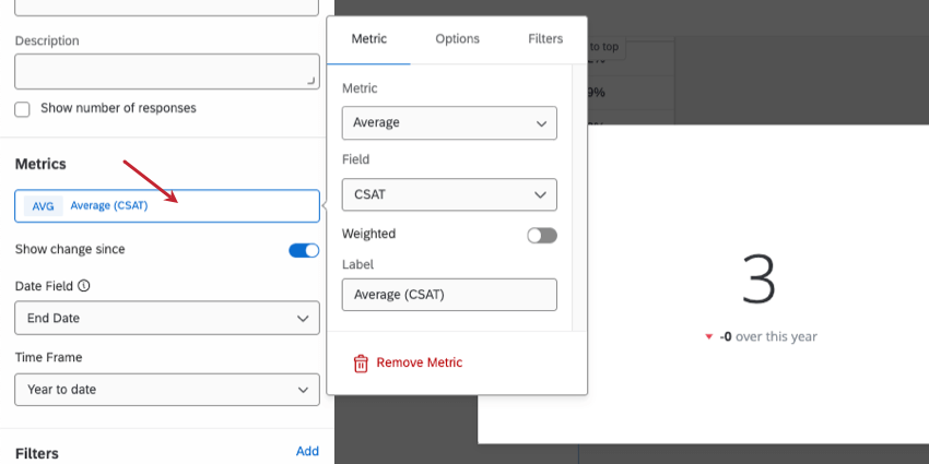
To set up a number chart widget, you will be required to add a metric. If you choose a metric other than count, you will be required to choose a field for the metric. The field specifies where the value of the number displayed in the widget is being pulled from.
To learn more about all of the metrics available for your number chart widget and all the ways you can customize them, see Widget Metrics.
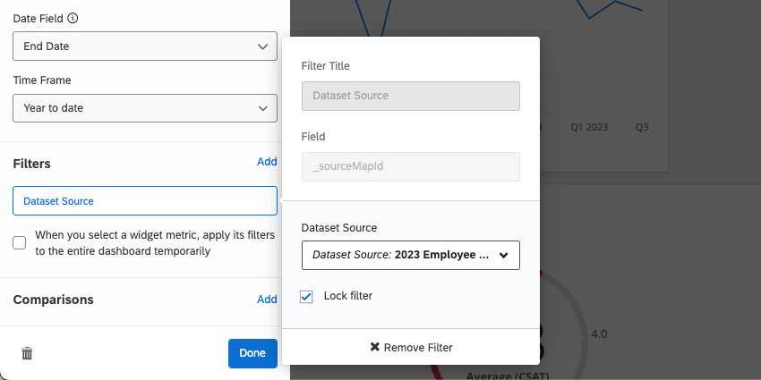
Qtip: If you have multiple data sources mapped, all source data will be displayed in the widget together. You will need to use a widget-level filter to ensure only one data source is displayed at a time. You can even lock this filter, if you don’t want dashboard users to adjust it.
Show Change Since
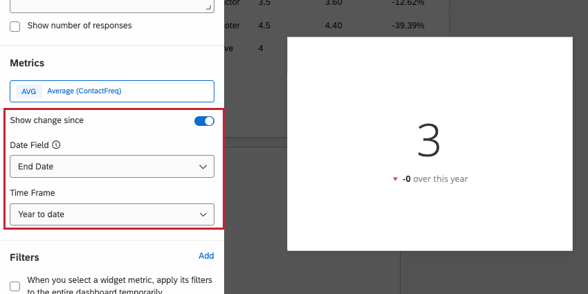
Checking the box next to Show change since allows you to display how the displayed numerical value has changed over a particular time period. The options for the Time Frame are:
- Yesterday
- 1 week ago
- 1 month ago
- 3 months ago
- 12 months ago
- Month to date
- Quarter to date
- Year to date
Under Date Field, select a date field from your dataset that you would like to use to base the selected time period on.
The values for this widget are calculated in the following manner:
- Current Value: Central, largest number. The chosen metric, filtered according to any filters applied at the page or widget level.
- Previous Value: Smaller, subscript number. The chosen metric, filtered according to any filters applied at the page or widget level, with the date range offset by the amount of time you select under “Show change since.”
Style
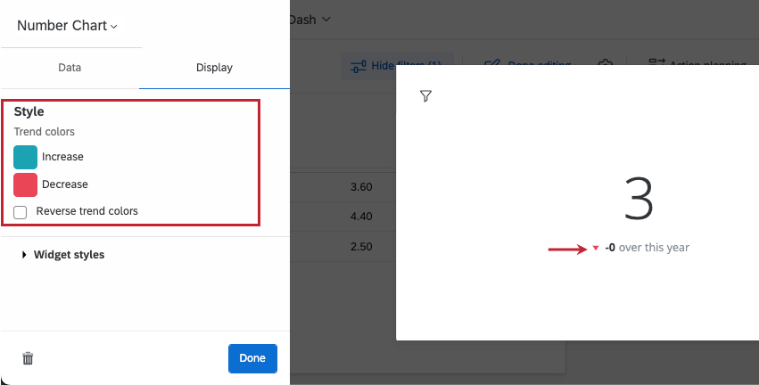
Go to the Display tab. Under Trend Colors, you’ll see the colors the arrow changes to in order to indicate an increase or a decrease. You can switch the colors by selecting Reverse trend colors.
